> ## Documentation Index
> Fetch the complete documentation index at: https://docs.adopt.ai/llms.txt
> Use this file to discover all available pages before exploring further.
# White-Label Theming
> Brand your Experience with a custom logo, color palette, typography, and CSS overrides.
Every Experience ships with a default Adopt visual style — clean, professional, and functional. But when you're delivering an Experience to a customer or embedding it into an internal tool, you often want it to feel like it belongs there, not like something dropped in from a third-party platform. White-label theming lets you replace the default styling with your own brand identity: logo, colors, fonts, and full CSS control.
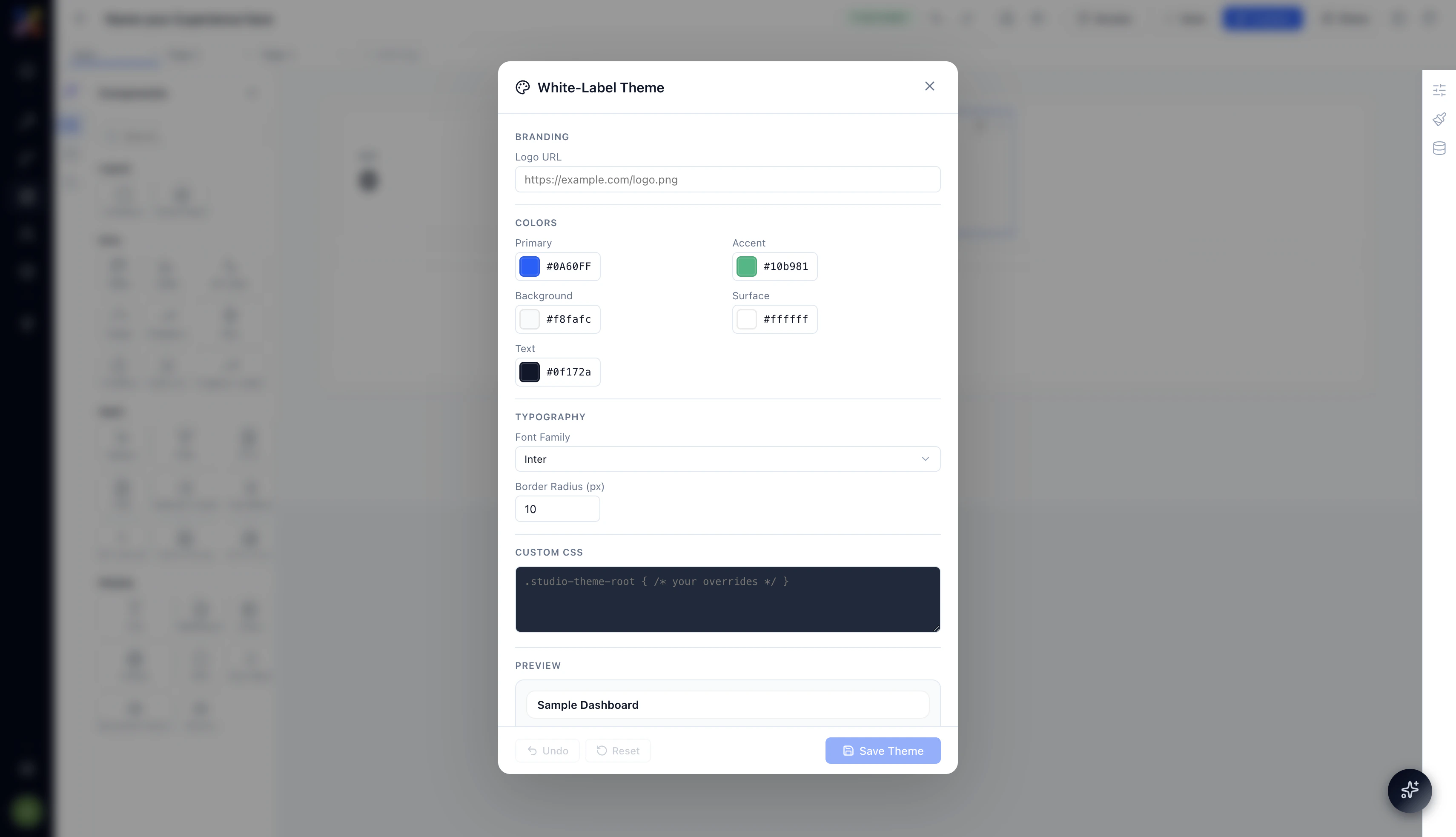
To open the theme editor, click the **⚙** icon in the top right corner of the Experience Builder.
 ## Branding
### Logo URL
Paste a publicly accessible URL to your logo image (PNG, SVG, or JPEG). The logo replaces the default Adopt wordmark in the Experience's top navigation bar — visible both in the preview and the published view.
```text theme={null}
https://your-company.com/assets/logo.png
```
Use an SVG for the sharpest result across screen densities. If your logo has a light and dark variant, use the light version — the default nav background is dark.
## Colors
The color system has five configurable values. All of them accept any valid hex code.
| Field | What it affects |
| -------------- | ---------------------------------------------------------------------------------------------- |
| **Primary** | Primary action color — buttons, active states, links, progress indicators. Default: `#0A60FF` |
| **Accent** | Secondary highlight color — badges, secondary buttons, chart accent series. Default: `#10b981` |
| **Background** | Page background behind all content. Default: `#f8fafc` |
| **Surface** | Card and container backgrounds — tables, panels, modal backgrounds. Default: `#ffffff` |
| **Text** | Default body text color across the Experience. Default: `#0f172a` |
Start with your brand's primary color in the **Primary** field and your background color in **Background**. Most Experiences look right with just those two changes. Accent, Surface, and Text can stay at defaults unless you have a strong reason to change them.
## Typography
### Font Family
Choose the font used for all text across the Experience. The dropdown includes a set of Google Fonts — Inter is the default. Select the font that best matches your brand's typographic style.
Font changes apply globally — every heading, label, table cell, and button label uses the selected font family.
### Border Radius (px)
Controls the corner rounding applied to cards, buttons, inputs, and containers across the Experience. Default is `10px`.
* **0** — sharp, square corners; suits technical or enterprise aesthetics
* **8–12** — the default soft rounded style
* **16+** — pillowed, consumer-app feel
Set this to match the visual language of the product you're embedding the Experience into.
## Custom CSS
For anything the standard theme controls don't cover, the **Custom CSS** field accepts any valid CSS rules. All rules are scoped under `.studio-theme-root` to prevent them from leaking outside the Experience.
```css theme={null}
.studio-theme-root {
/* Your overrides here */
--font-size-base: 14px;
--nav-background: #1e293b;
--nav-text: #f1f5f9;
}
```
You can override specific component styles, adjust spacing, change the nav appearance, or apply any visual treatment that the higher-level controls don't expose. This is the escape hatch for full brand fidelity.
Custom CSS overrides apply to the entire Experience — including all pages and all components. Test your overrides in Preview mode before publishing to make sure nothing has broken unexpectedly.
## Saving and Resetting
At the bottom of the theme editor:
* **Save Theme** — applies your changes and saves them to the Experience. The canvas updates immediately to reflect the new theme.
* **Undo** — reverts the most recent change in the theme editor.
* **Reset** — restores all theme settings to the Adopt defaults. This cannot be undone — use it only if you want to start over from scratch.
## Why White-Labeling Matters
The moment an Experience looks like it was built in-house, your team and customers interact with it differently. They trust it more. They use it more naturally. And when you're delivering an Experience as part of a product built on Adopt, a white-labeled Experience is often indistinguishable from a natively built tool — which is exactly the point.
Combined with custom access control and embed options, white-label theming is the final layer that makes Experiences genuinely deployable as customer-facing surfaces, not just internal utilities.
## Next Steps
* [Publish and share your themed Experience](/essentials/experience-publishing-and-sharing)
## Branding
### Logo URL
Paste a publicly accessible URL to your logo image (PNG, SVG, or JPEG). The logo replaces the default Adopt wordmark in the Experience's top navigation bar — visible both in the preview and the published view.
```text theme={null}
https://your-company.com/assets/logo.png
```
Use an SVG for the sharpest result across screen densities. If your logo has a light and dark variant, use the light version — the default nav background is dark.
## Colors
The color system has five configurable values. All of them accept any valid hex code.
| Field | What it affects |
| -------------- | ---------------------------------------------------------------------------------------------- |
| **Primary** | Primary action color — buttons, active states, links, progress indicators. Default: `#0A60FF` |
| **Accent** | Secondary highlight color — badges, secondary buttons, chart accent series. Default: `#10b981` |
| **Background** | Page background behind all content. Default: `#f8fafc` |
| **Surface** | Card and container backgrounds — tables, panels, modal backgrounds. Default: `#ffffff` |
| **Text** | Default body text color across the Experience. Default: `#0f172a` |
Start with your brand's primary color in the **Primary** field and your background color in **Background**. Most Experiences look right with just those two changes. Accent, Surface, and Text can stay at defaults unless you have a strong reason to change them.
## Typography
### Font Family
Choose the font used for all text across the Experience. The dropdown includes a set of Google Fonts — Inter is the default. Select the font that best matches your brand's typographic style.
Font changes apply globally — every heading, label, table cell, and button label uses the selected font family.
### Border Radius (px)
Controls the corner rounding applied to cards, buttons, inputs, and containers across the Experience. Default is `10px`.
* **0** — sharp, square corners; suits technical or enterprise aesthetics
* **8–12** — the default soft rounded style
* **16+** — pillowed, consumer-app feel
Set this to match the visual language of the product you're embedding the Experience into.
## Custom CSS
For anything the standard theme controls don't cover, the **Custom CSS** field accepts any valid CSS rules. All rules are scoped under `.studio-theme-root` to prevent them from leaking outside the Experience.
```css theme={null}
.studio-theme-root {
/* Your overrides here */
--font-size-base: 14px;
--nav-background: #1e293b;
--nav-text: #f1f5f9;
}
```
You can override specific component styles, adjust spacing, change the nav appearance, or apply any visual treatment that the higher-level controls don't expose. This is the escape hatch for full brand fidelity.
Custom CSS overrides apply to the entire Experience — including all pages and all components. Test your overrides in Preview mode before publishing to make sure nothing has broken unexpectedly.
## Saving and Resetting
At the bottom of the theme editor:
* **Save Theme** — applies your changes and saves them to the Experience. The canvas updates immediately to reflect the new theme.
* **Undo** — reverts the most recent change in the theme editor.
* **Reset** — restores all theme settings to the Adopt defaults. This cannot be undone — use it only if you want to start over from scratch.
## Why White-Labeling Matters
The moment an Experience looks like it was built in-house, your team and customers interact with it differently. They trust it more. They use it more naturally. And when you're delivering an Experience as part of a product built on Adopt, a white-labeled Experience is often indistinguishable from a natively built tool — which is exactly the point.
Combined with custom access control and embed options, white-label theming is the final layer that makes Experiences genuinely deployable as customer-facing surfaces, not just internal utilities.
## Next Steps
* [Publish and share your themed Experience](/essentials/experience-publishing-and-sharing)