> ## Documentation Index
> Fetch the complete documentation index at: https://docs.adopt.ai/llms.txt
> Use this file to discover all available pages before exploring further.
# Inside the Experience Builder
> A complete tour of every panel, control, and toolbar in the Experience Builder.
The Experience Builder is where you design, configure, and preview your Experience. It's split into three zones: a **left panel** for adding and managing everything in your build, a **central canvas** where your pages come to life, and a **right panel** for configuring whatever widget you have selected. Here's a complete walkthrough of each.
## The Top Toolbar
The toolbar runs across the top of the builder and gives you global controls for the entire Experience.
| Control | What it does |
| --------------------- | ----------------------------------------------------------------------- |
| **Undo / Redo** | Step backwards or forwards through your recent edits |
| **Add Page** | Add a new blank page to the Experience |
| **Layout Toggle** | Switch between desktop and mobile canvas view |
| **Preview** | Open the live preview — see the Experience exactly as a viewer would |
| **Access** | Open the Access Control panel — manage who can view or edit |
| **Save** | Manually save the current state (auto-save also runs in the background) |
| **Publish** | Push the current state live and make it accessible via share link |
| **Share** | Open the share and embed panel |
| **White-Label Theme** | Open the branding and theme settings |
## The Left Panel
The left panel is your build toolkit. It has four sections, each accessible via the icon strip on its left edge.
### AI Builder
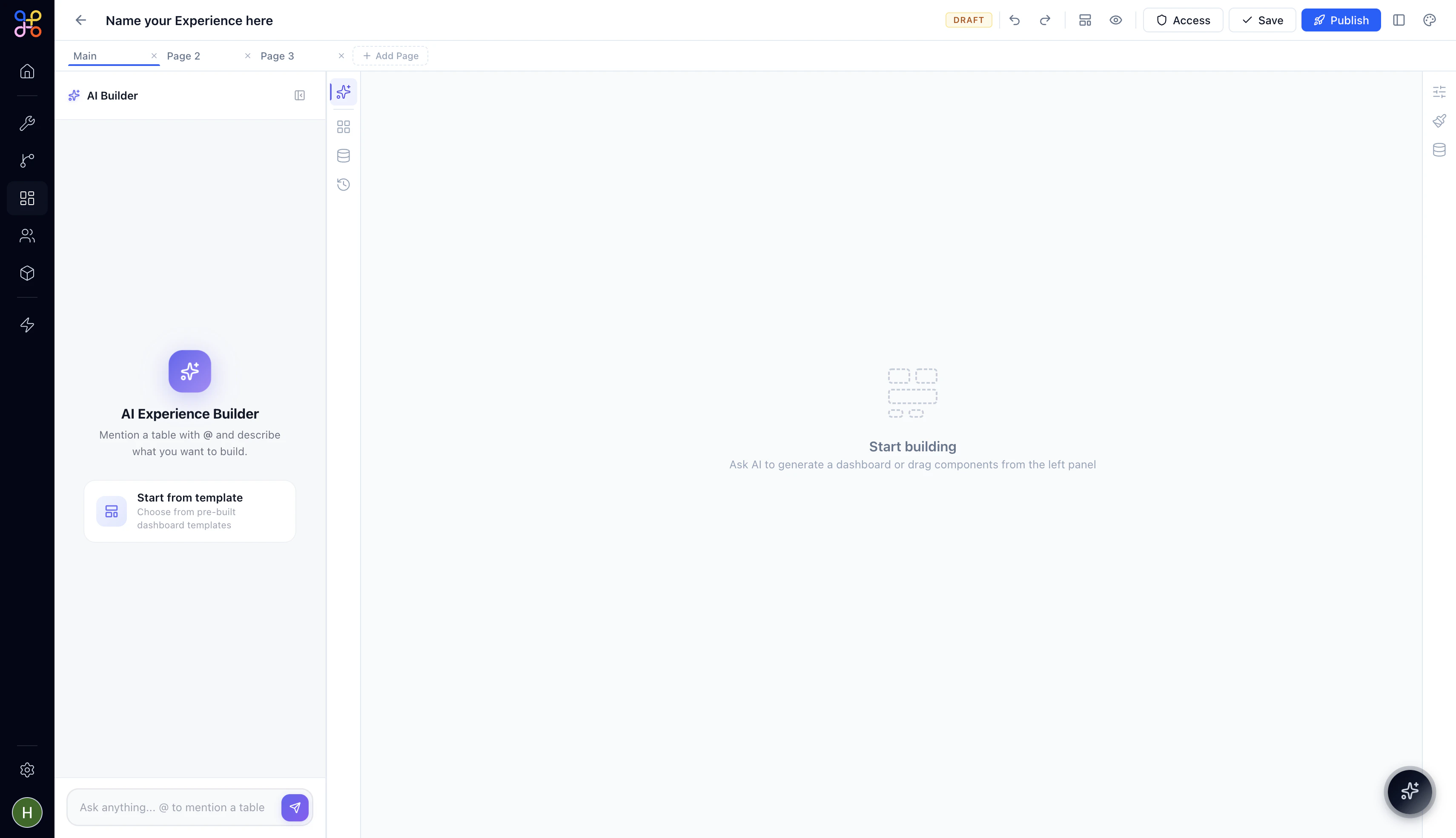 The AI Builder is the default view when you open a new Experience. It gives you two ways to get started:
**AI Experience Builder** — Type a prompt in the chat input at the bottom of the panel. Use `@` to mention a data table and describe the dashboard or tool you want. The AI places widgets on the canvas and connects them to your referenced table.
**Start from template** — Opens the template picker with six pre-built layouts. See [Creating a New Experience](/essentials/creating-a-new-experience) for the full template breakdown.
The AI Builder chat input is available at all times — not just on a blank canvas. Use it at any point to ask the AI to add new sections, restructure a page, or generate widgets for a table you've just connected.
### Components
The AI Builder is the default view when you open a new Experience. It gives you two ways to get started:
**AI Experience Builder** — Type a prompt in the chat input at the bottom of the panel. Use `@` to mention a data table and describe the dashboard or tool you want. The AI places widgets on the canvas and connects them to your referenced table.
**Start from template** — Opens the template picker with six pre-built layouts. See [Creating a New Experience](/essentials/creating-a-new-experience) for the full template breakdown.
The AI Builder chat input is available at all times — not just on a blank canvas. Use it at any point to ask the AI to add new sections, restructure a page, or generate widgets for a table you've just connected.
### Components
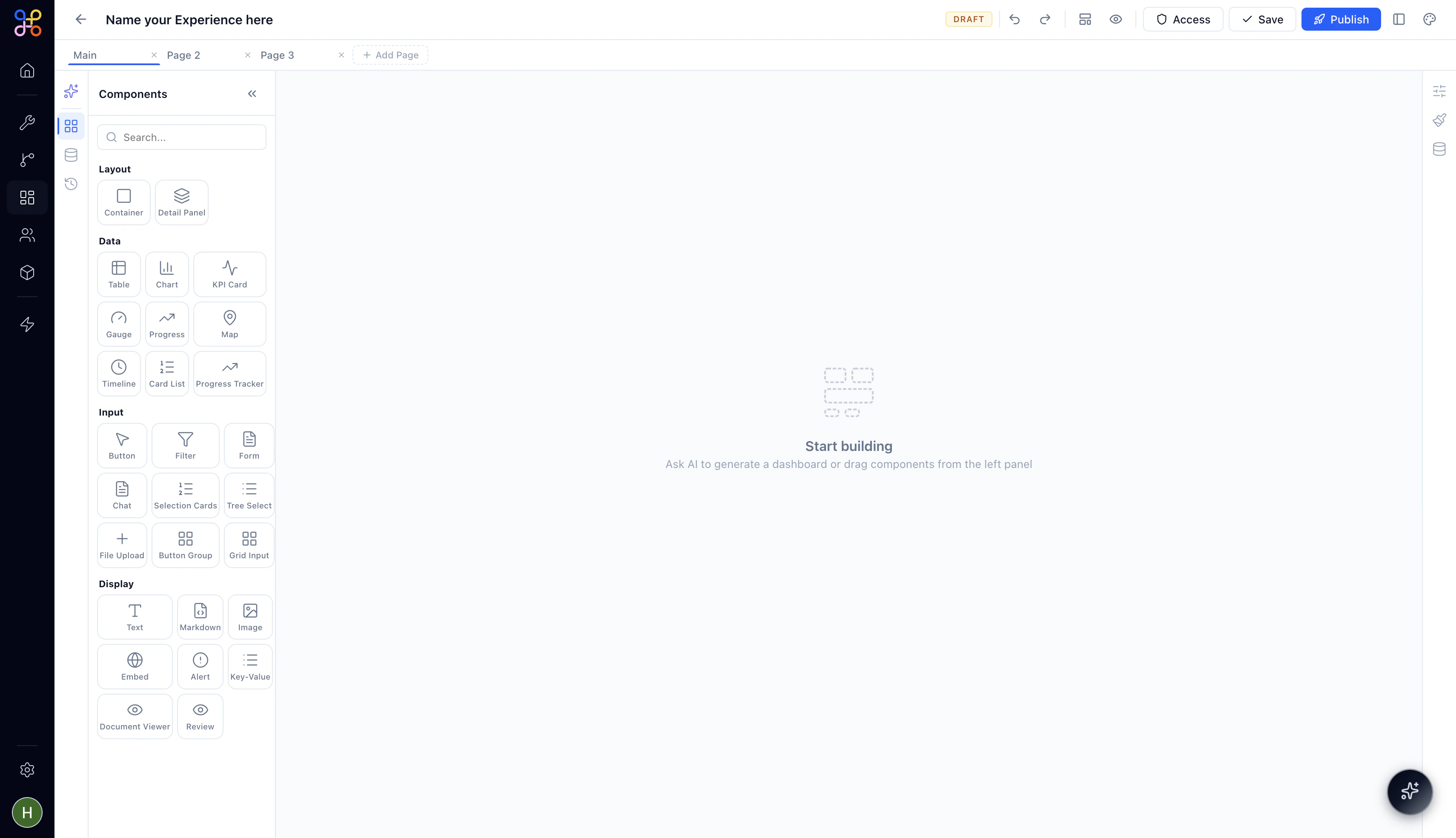 The Components panel is your widget library. Every component you can place on a canvas page lives here, organized into four categories:
* **Layout** — Structural containers: Container, Detail Panel
* **Data** — Visualizations and data displays: Table, Chart, KPI Card, Gauge, Progress, Map, Timeline, Card List, Progress Tracker
* **Input** — Interactive elements: Button, Filter, Form, Chat, Selection Cards, Tree Select, File Upload, Button Group, Grid Input
* **Display** — Static and enriched content: Text, Markdown, Image, Embed, Alert, Key-Value, Document Viewer, Review
Drag any component from the panel onto your canvas to place it. For a detailed breakdown of every component and when to use it, see the [Components Reference](/essentials/experience-components-reference).
### Data
The Components panel is your widget library. Every component you can place on a canvas page lives here, organized into four categories:
* **Layout** — Structural containers: Container, Detail Panel
* **Data** — Visualizations and data displays: Table, Chart, KPI Card, Gauge, Progress, Map, Timeline, Card List, Progress Tracker
* **Input** — Interactive elements: Button, Filter, Form, Chat, Selection Cards, Tree Select, File Upload, Button Group, Grid Input
* **Display** — Static and enriched content: Text, Markdown, Image, Embed, Alert, Key-Value, Document Viewer, Review
Drag any component from the panel onto your canvas to place it. For a detailed breakdown of every component and when to use it, see the [Components Reference](/essentials/experience-components-reference).
### Data
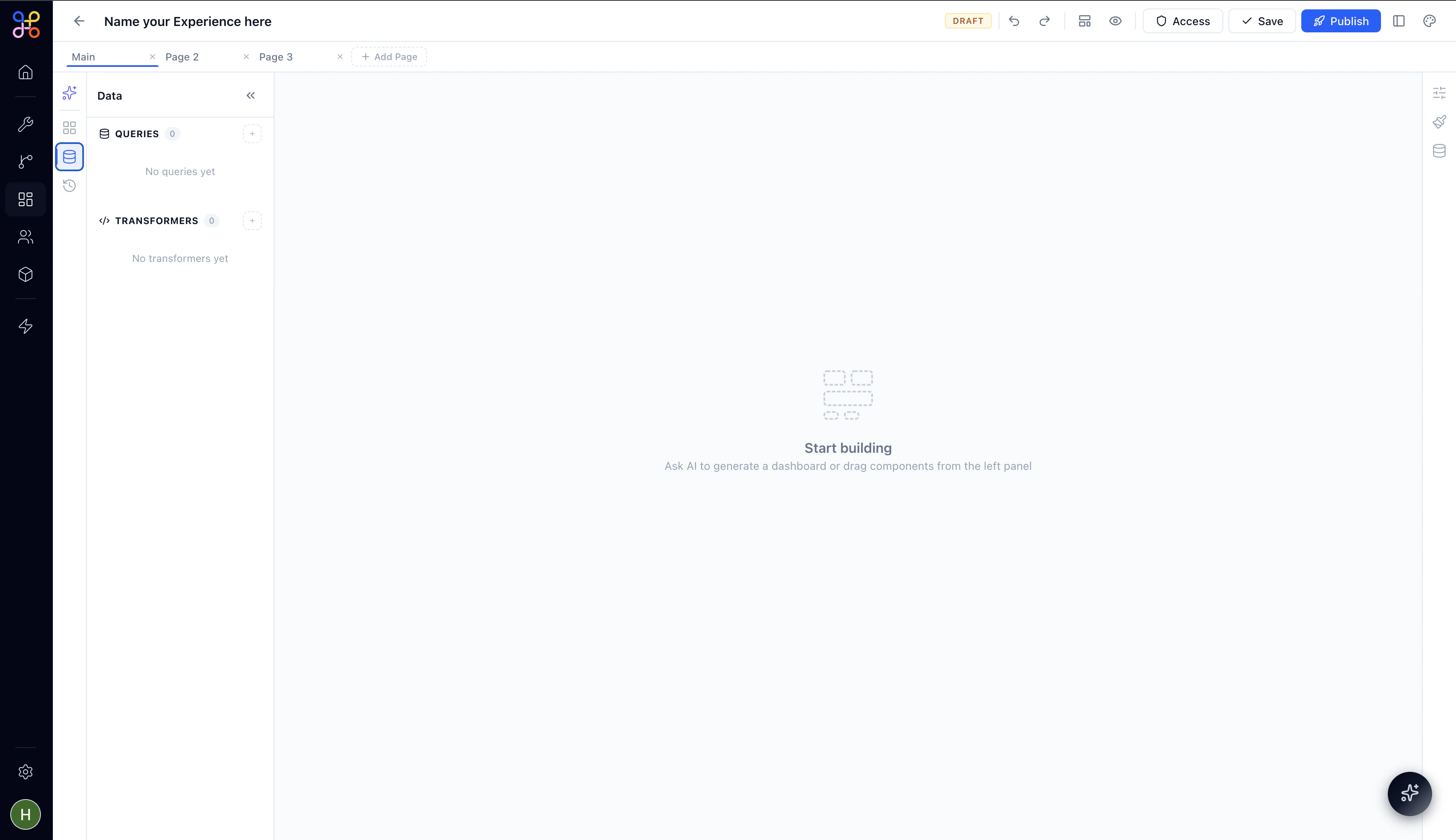 The Data panel is where you manage the data sources that power your widgets. It has two sections:
**Queries** — SQL queries that pull data from your connected Pipeline Outcomes. Each query you create here becomes a named data source that any widget on the page can reference. A `SQL` badge appears next to each query name.
**Transformers** — JavaScript functions that reshape or derive data from your queries before it reaches a widget. Use a Transformer when you need to join, filter, sort, or compute values from raw query output before binding it to a component.
See [Connecting Data](/essentials/experience-connecting-data) for a full walkthrough on writing queries and binding data to widgets.
### Versions
The Data panel is where you manage the data sources that power your widgets. It has two sections:
**Queries** — SQL queries that pull data from your connected Pipeline Outcomes. Each query you create here becomes a named data source that any widget on the page can reference. A `SQL` badge appears next to each query name.
**Transformers** — JavaScript functions that reshape or derive data from your queries before it reaches a widget. Use a Transformer when you need to join, filter, sort, or compute values from raw query output before binding it to a component.
See [Connecting Data](/essentials/experience-connecting-data) for a full walkthrough on writing queries and binding data to widgets.
### Versions
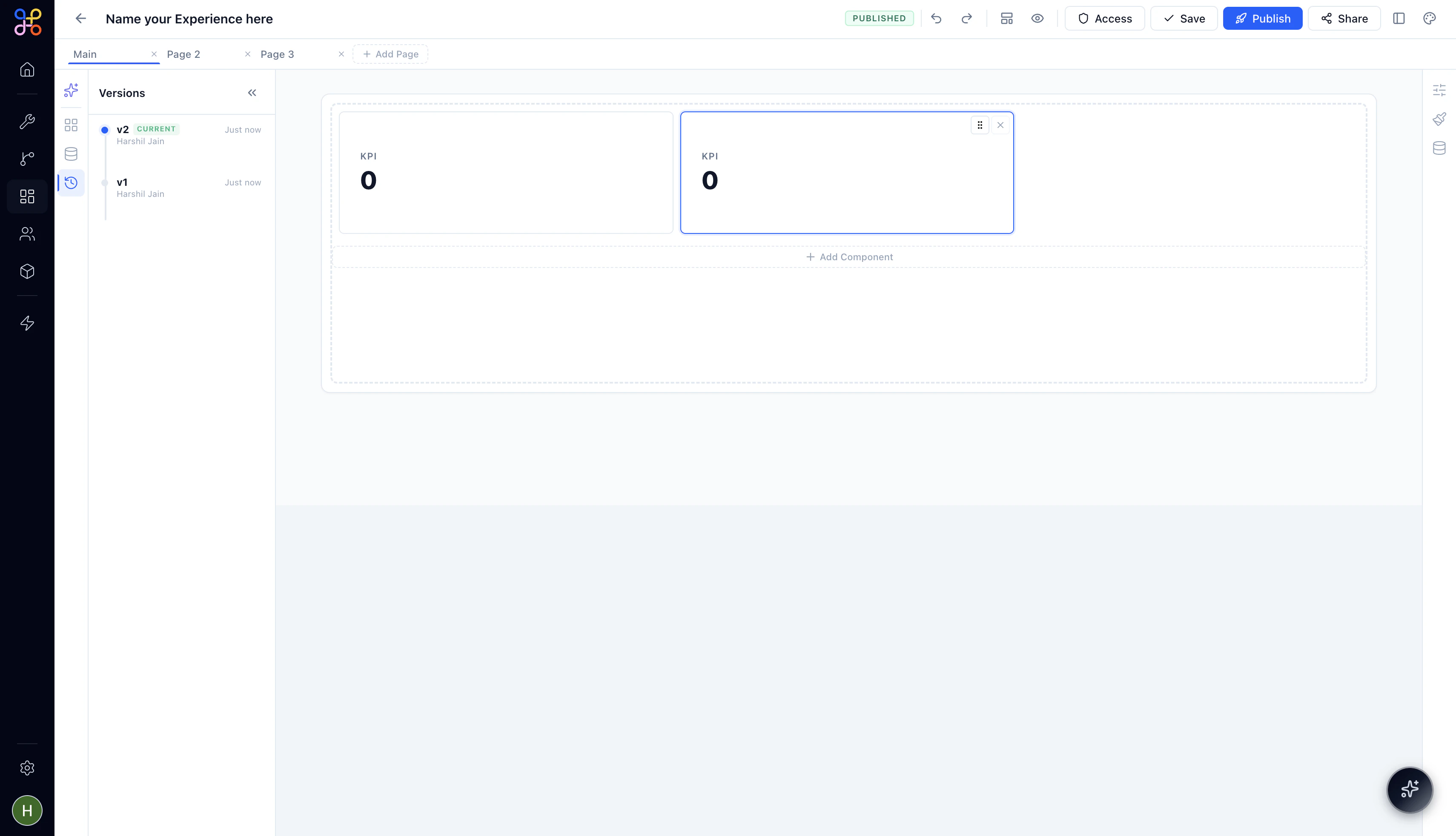 The Versions panel shows the history of saved states for this Experience. Each version is stamped with who saved it and when. The current live version is marked **CURRENT**.
Click any version to review it. Versions give you a safe fallback — if an edit goes wrong, you can always restore a previous state.
## The Canvas
The central canvas is your design surface. Each page in your Experience has its own canvas. You switch between pages using the tabs at the top.
The canvas shows an accurate preview of how the Experience will render for viewers — component sizes, layouts, and data all update as you build. When the canvas is empty, it shows a **"Start building"** prompt with two entry points: prompt the AI Builder or drag a component from the left panel.
Widgets on the canvas are interactive in builder mode — you can click any widget to select it, then use the right panel to configure its properties, styles, and data bindings. Drag from a widget's edge to resize it.
## The Right Panel
The right panel is context-sensitive — it shows configuration options for whatever widget you have selected on the canvas. It has three tabs, accessible via the icon strip on its right edge.
### Properties
The Properties panel controls the widget's behavior and content settings — things like column definitions for a Table, the metric a KPI Card displays, or the label on a Button. Every widget type has its own set of properties.
### Styles
The Styles panel controls the visual appearance of the selected widget — padding, border radius, background color, text sizing, and more. Style changes apply only to the selected widget, not the page globally.
For global theming — colors, fonts, logo — use the White-Label Theme settings in the top toolbar. Styles in the right panel are for per-widget overrides.
### Data Binding
The Data binding panel is where you connect a widget to a data source. Select a widget, open this panel, and choose which Query or Transformer result should populate it. For a Table, that's the full result set. For a KPI Card, it's a specific column and aggregation. For a Filter, it's the column whose values should appear as filter options.
## Preview Mode
Click the **Preview** icon (👁) in the top toolbar to enter Preview mode. The builder chrome disappears completely and you see the Experience exactly as a viewer would — with the left-side page navigation, all widgets rendered with live data, and interactive filters and buttons fully functional.
Click **Exit Preview** in the top left to return to the builder.
## Next Steps
1. [Add components to your pages](/essentials/experience-components-reference)
2. [Connect your pipeline data](/essentials/experience-connecting-data)
3. [Publish and share your Experience](/essentials/experience-publishing-and-sharing)
The Versions panel shows the history of saved states for this Experience. Each version is stamped with who saved it and when. The current live version is marked **CURRENT**.
Click any version to review it. Versions give you a safe fallback — if an edit goes wrong, you can always restore a previous state.
## The Canvas
The central canvas is your design surface. Each page in your Experience has its own canvas. You switch between pages using the tabs at the top.
The canvas shows an accurate preview of how the Experience will render for viewers — component sizes, layouts, and data all update as you build. When the canvas is empty, it shows a **"Start building"** prompt with two entry points: prompt the AI Builder or drag a component from the left panel.
Widgets on the canvas are interactive in builder mode — you can click any widget to select it, then use the right panel to configure its properties, styles, and data bindings. Drag from a widget's edge to resize it.
## The Right Panel
The right panel is context-sensitive — it shows configuration options for whatever widget you have selected on the canvas. It has three tabs, accessible via the icon strip on its right edge.
### Properties
The Properties panel controls the widget's behavior and content settings — things like column definitions for a Table, the metric a KPI Card displays, or the label on a Button. Every widget type has its own set of properties.
### Styles
The Styles panel controls the visual appearance of the selected widget — padding, border radius, background color, text sizing, and more. Style changes apply only to the selected widget, not the page globally.
For global theming — colors, fonts, logo — use the White-Label Theme settings in the top toolbar. Styles in the right panel are for per-widget overrides.
### Data Binding
The Data binding panel is where you connect a widget to a data source. Select a widget, open this panel, and choose which Query or Transformer result should populate it. For a Table, that's the full result set. For a KPI Card, it's a specific column and aggregation. For a Filter, it's the column whose values should appear as filter options.
## Preview Mode
Click the **Preview** icon (👁) in the top toolbar to enter Preview mode. The builder chrome disappears completely and you see the Experience exactly as a viewer would — with the left-side page navigation, all widgets rendered with live data, and interactive filters and buttons fully functional.
Click **Exit Preview** in the top left to return to the builder.
## Next Steps
1. [Add components to your pages](/essentials/experience-components-reference)
2. [Connect your pipeline data](/essentials/experience-connecting-data)
3. [Publish and share your Experience](/essentials/experience-publishing-and-sharing)