> ## Documentation Index
> Fetch the complete documentation index at: https://docs.adopt.ai/llms.txt
> Use this file to discover all available pages before exploring further.
# Using Pipelines in Experiences
> Learn how to bind Pipeline Outcomes to HITL Experience components so human reviewers see live, structured data.
## Overview
**Experiences** in Adopt AI are the Human-in-the-Loop (HITL) interfaces where human reviewers inspect, validate, and approve agent work. Pipelines power the data layer of these interfaces — you bind a Pipeline Outcome to a table, chart, or data component in the Experience Builder, and the component automatically displays the most recent data from that outcome.
This means reviewers see real, structured business data (not a static mock) every time they open an Experience.
***
## Why Bind Pipelines to Experiences?
Without Pipeline bindings, an Experience would either show static data or require the agent to pass all necessary context at runtime — which is inefficient and brittle.
With Pipeline bindings:
* **Data is always fresh** — the Pipeline runs on its schedule; the Experience always reflects the latest outcome
* **Dashboards load instantly** — no live API calls when the reviewer opens the interface
* **Consistent data model** — the same Pipeline outcome can drive multiple Experience components
* **Separation of concerns** — data preparation (Pipeline) is decoupled from data presentation (Experience)
***
## How Pipeline Bindings Work
In the Experience Builder, each data-displaying component (table, chart, metric card) has a **Data Source** configuration. You select a Pipeline Outcome as the data source, map the outcome's columns to the component's fields, and the component renders live data when the Experience is opened.
The binding is configured once; the data refreshes automatically each time the Pipeline runs.
***
## Setting Up a Pipeline Binding
### Step 1 — Open the Experience Builder
Navigate to your Experience in the Orchestration section and open it in the builder.
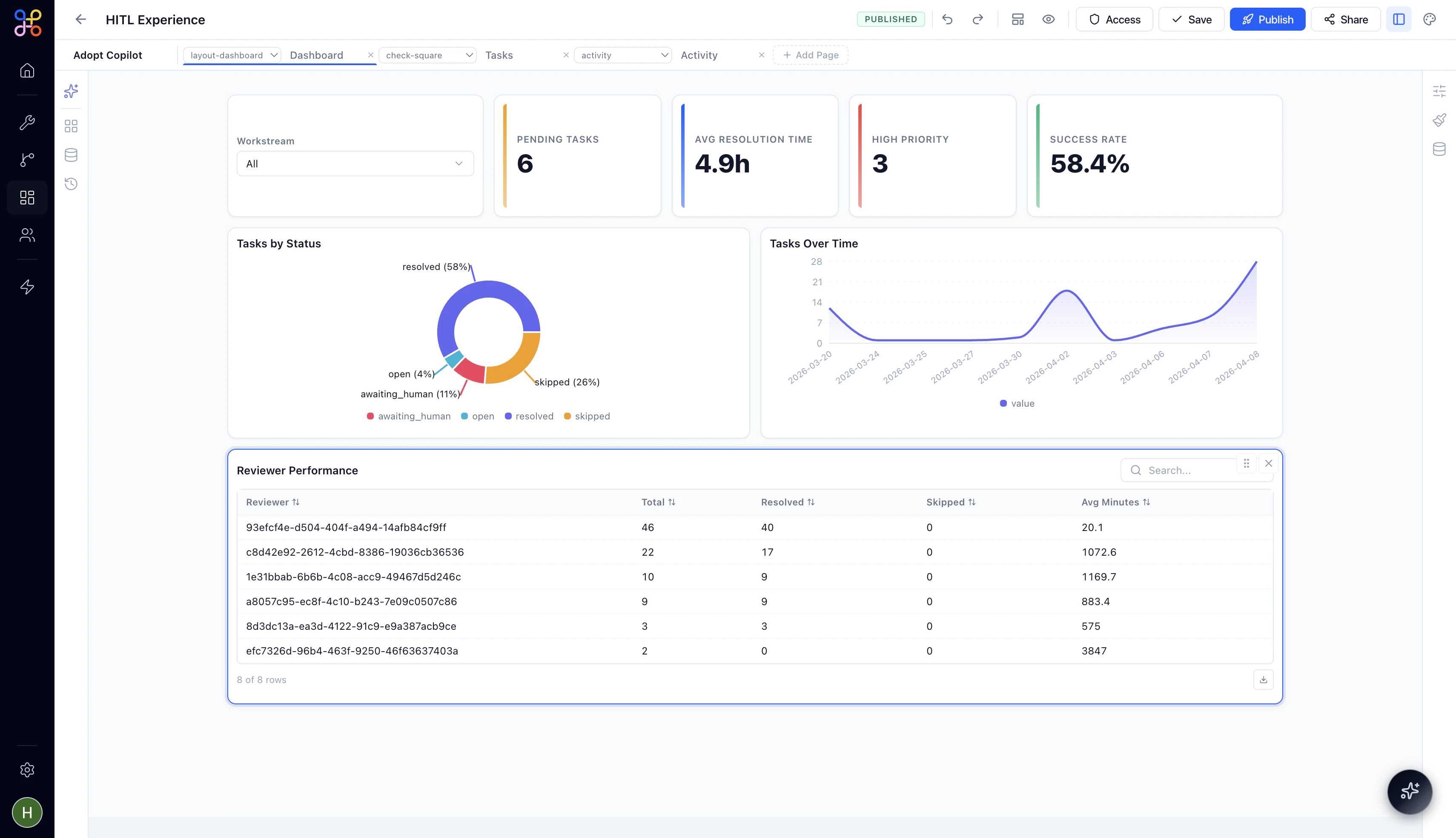 ### Step 2 — Add a data component
From the component palette, drag a **Table**, **Chart**, or **Metric** component onto the canvas.
### Step 2 — Add a data component
From the component palette, drag a **Table**, **Chart**, or **Metric** component onto the canvas.
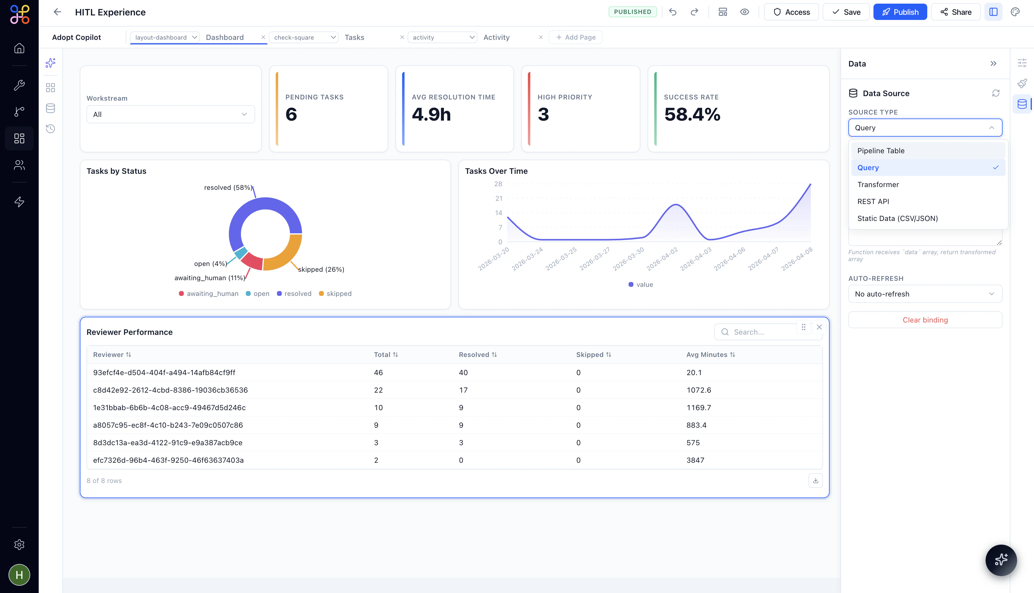 ### Step 3 — Configure the data source
Click on the component to open its configuration panel. Under **Data Source**, select **Pipeline Outcome**.
### Step 3 — Configure the data source
Click on the component to open its configuration panel. Under **Data Source**, select **Pipeline Outcome**.
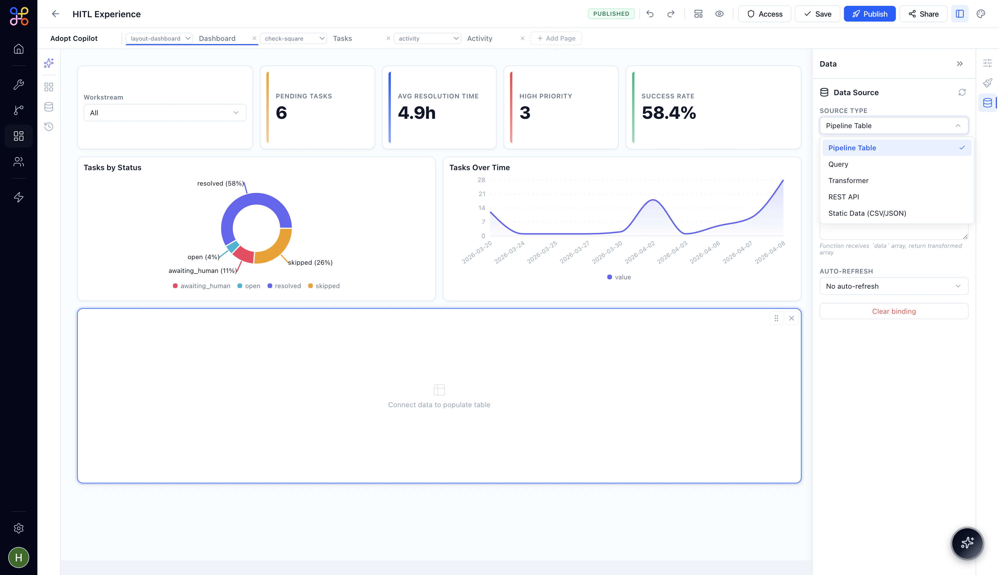 A dropdown will appear listing all active Pipelines in the current project. Select the pipeline whose outcome you want to display.
### Step 4 — Select the Outcome
Once a pipeline is selected, choose the specific **Outcome** (the named output table). For example, if your pipeline produces `deals_over_10k`, select that.
A dropdown will appear listing all active Pipelines in the current project. Select the pipeline whose outcome you want to display.
### Step 4 — Select the Outcome
Once a pipeline is selected, choose the specific **Outcome** (the named output table). For example, if your pipeline produces `deals_over_10k`, select that.
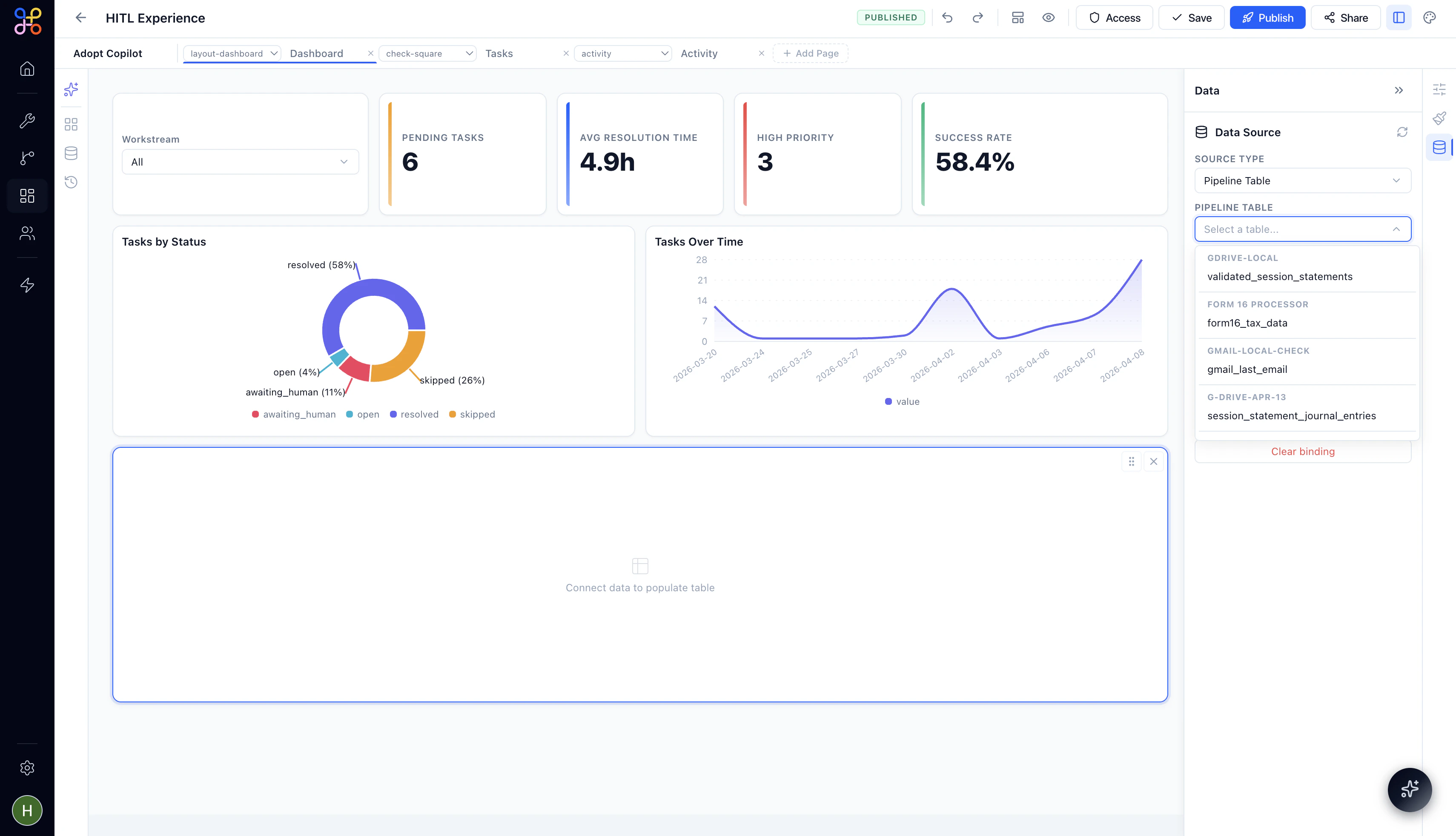 ### Step 5 — Map columns to component fields
The builder will display the columns available in the selected outcome. Map them to the component's display fields:
* For a **Table**: each outcome column becomes a table column
* For a **Chart**: map outcome columns to X-axis, Y-axis, and series fields
* For a **Metric card**: select the outcome column to aggregate (sum, count, average)
### Step 5 — Map columns to component fields
The builder will display the columns available in the selected outcome. Map them to the component's display fields:
* For a **Table**: each outcome column becomes a table column
* For a **Chart**: map outcome columns to X-axis, Y-axis, and series fields
* For a **Metric card**: select the outcome column to aggregate (sum, count, average)
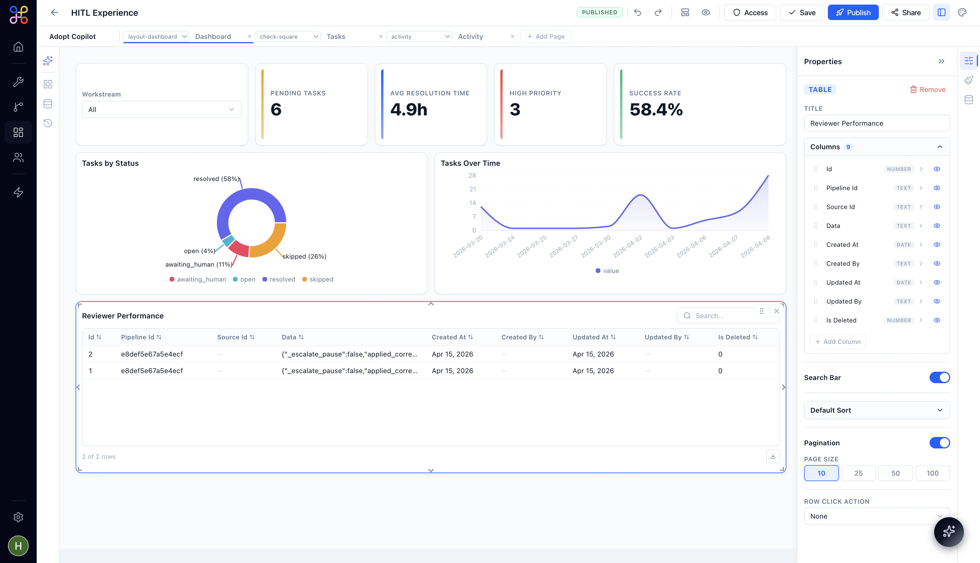 ### Step 6 — Preview and publish
Use the **Preview** mode to see how the component will render with real Pipeline data. Once satisfied, publish the Experience.
***
## Example: Expense Review Dashboard
**Use case:** A finance team reviews AI-generated expense categorizations before final submission.
**Pipeline:** `QuickBooks Expense Aggregation` — daily, produces `aggregated_expenses` with columns: `category`, `total_amount`, `transaction_count`, `period`.
**Experience layout:**
```text theme={null}
┌────────────────────────────────────────────┐
│ Expense Review — March 2026 │
│ │
│ [Metric: Total Expenses] │
│ Bound to: aggregated_expenses → SUM(total_amount)
│ │
│ [Table: Expenses by Category] │
│ Bound to: aggregated_expenses │
│ Columns: category, total_amount, count │
│ │
│ [Agent Decision Panel] │
│ "The following categories were flagged..."│
│ │
│ [ Approve ] [ Request Changes ] │
└────────────────────────────────────────────┘
```
The finance reviewer sees current totals and a breakdown table driven by the Pipeline — no manual data preparation required.
***
## Example: Risk Monitoring Dashboard
**Use case:** A compliance team monitors deals flagged for risk review.
**Pipeline:** `Deals Over Threshold` — hourly, produces `deals_over_10k` with columns: `deal_name`, `amount`, `risk_score`, `assigned_rep`.
**Experience layout:**
* A **Table** showing all deals above the threshold, sorted by risk score
* A **Metric card** showing total deal value at risk
* An **Approve / Escalate** action panel for the reviewer
Because the Pipeline runs hourly, the dashboard always reflects the current state of the pipeline — new deals appear as soon as the next Pipeline run completes.
***
## Multiple Components, One Pipeline
A single Pipeline Outcome can power multiple components within the same Experience. For example, `aggregated_expenses` could drive both a summary table and a bar chart on the same dashboard — both stay in sync because they're bound to the same outcome.
Design your Pipeline Outcomes with the Experience in mind. If you know reviewers need to see data sorted, filtered, or grouped in a particular way, consider building that transformation into the Pipeline itself rather than relying on the Experience to do it.
***
## Pipeline Data Refresh in Experiences
Experiences display Pipeline data as of the most recent successful Pipeline run. They do not trigger Pipeline runs themselves.
If a reviewer needs the most current data possible:
1. Navigate to the Pipeline and click **Test Run** (or wait for the next scheduled run)
2. Reload the Experience after the run completes
Future versions of Adopt AI may support on-demand refresh directly from within the Experience. Check the product changelog for updates.
***
## Next Steps
* [Best Practices](/essentials/pipelines-best-practices) — design patterns for reliable pipeline-experience integrations
### Step 6 — Preview and publish
Use the **Preview** mode to see how the component will render with real Pipeline data. Once satisfied, publish the Experience.
***
## Example: Expense Review Dashboard
**Use case:** A finance team reviews AI-generated expense categorizations before final submission.
**Pipeline:** `QuickBooks Expense Aggregation` — daily, produces `aggregated_expenses` with columns: `category`, `total_amount`, `transaction_count`, `period`.
**Experience layout:**
```text theme={null}
┌────────────────────────────────────────────┐
│ Expense Review — March 2026 │
│ │
│ [Metric: Total Expenses] │
│ Bound to: aggregated_expenses → SUM(total_amount)
│ │
│ [Table: Expenses by Category] │
│ Bound to: aggregated_expenses │
│ Columns: category, total_amount, count │
│ │
│ [Agent Decision Panel] │
│ "The following categories were flagged..."│
│ │
│ [ Approve ] [ Request Changes ] │
└────────────────────────────────────────────┘
```
The finance reviewer sees current totals and a breakdown table driven by the Pipeline — no manual data preparation required.
***
## Example: Risk Monitoring Dashboard
**Use case:** A compliance team monitors deals flagged for risk review.
**Pipeline:** `Deals Over Threshold` — hourly, produces `deals_over_10k` with columns: `deal_name`, `amount`, `risk_score`, `assigned_rep`.
**Experience layout:**
* A **Table** showing all deals above the threshold, sorted by risk score
* A **Metric card** showing total deal value at risk
* An **Approve / Escalate** action panel for the reviewer
Because the Pipeline runs hourly, the dashboard always reflects the current state of the pipeline — new deals appear as soon as the next Pipeline run completes.
***
## Multiple Components, One Pipeline
A single Pipeline Outcome can power multiple components within the same Experience. For example, `aggregated_expenses` could drive both a summary table and a bar chart on the same dashboard — both stay in sync because they're bound to the same outcome.
Design your Pipeline Outcomes with the Experience in mind. If you know reviewers need to see data sorted, filtered, or grouped in a particular way, consider building that transformation into the Pipeline itself rather than relying on the Experience to do it.
***
## Pipeline Data Refresh in Experiences
Experiences display Pipeline data as of the most recent successful Pipeline run. They do not trigger Pipeline runs themselves.
If a reviewer needs the most current data possible:
1. Navigate to the Pipeline and click **Test Run** (or wait for the next scheduled run)
2. Reload the Experience after the run completes
Future versions of Adopt AI may support on-demand refresh directly from within the Experience. Check the product changelog for updates.
***
## Next Steps
* [Best Practices](/essentials/pipelines-best-practices) — design patterns for reliable pipeline-experience integrations