Every Experience ships with a default Adopt visual style — clean, professional, and functional. But when you’re delivering an Experience to a customer or embedding it into an internal tool, you often want it to feel like it belongs there, not like something dropped in from a third-party platform. White-label theming lets you replace the default styling with your own brand identity: logo, colors, fonts, and full CSS control.
To open the theme editor, click the ⚙ icon in the top right corner of the Experience Builder.
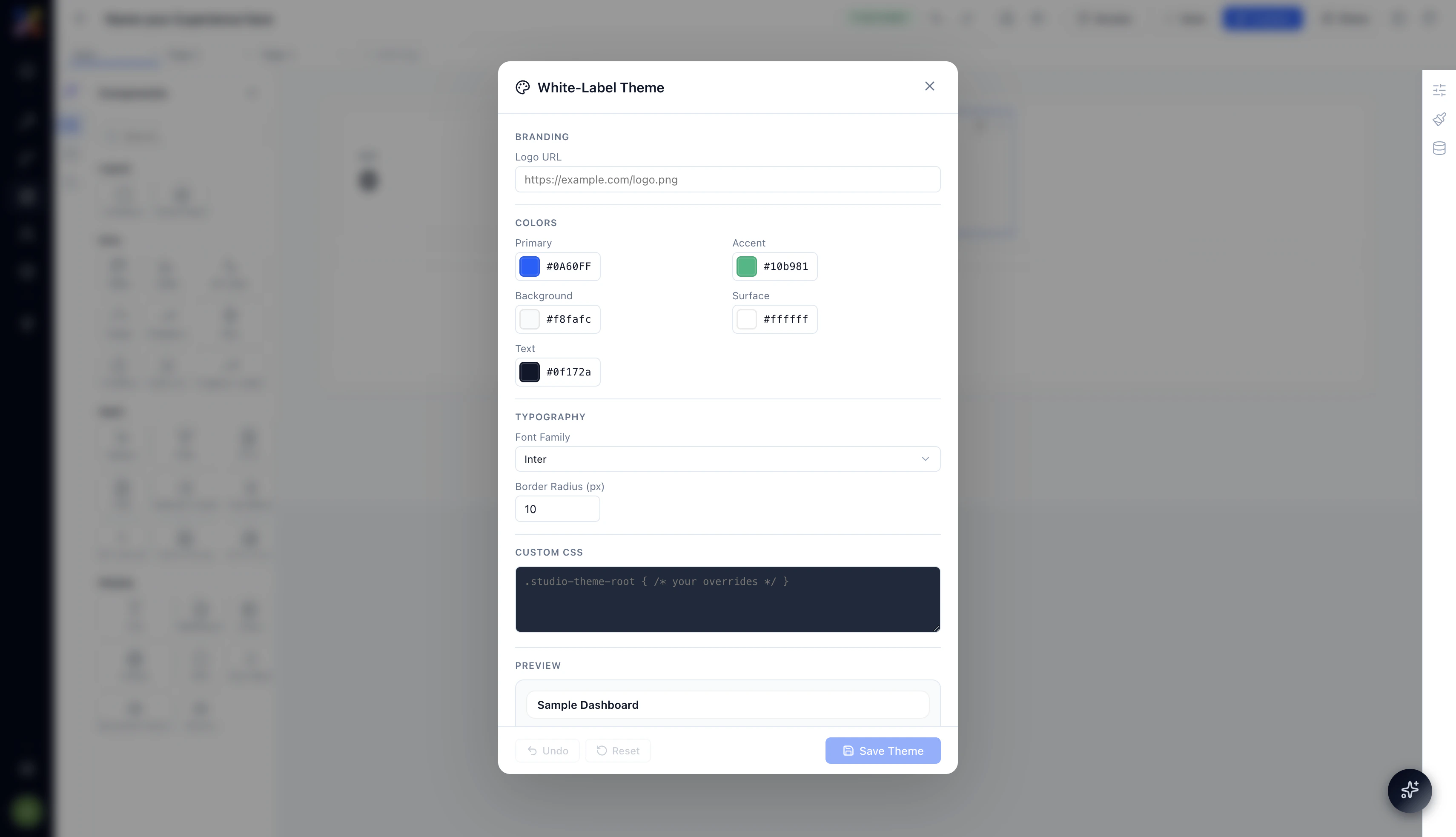
Branding
Logo URL
Paste a publicly accessible URL to your logo image (PNG, SVG, or JPEG). The logo replaces the default Adopt wordmark in the Experience’s top navigation bar — visible both in the preview and the published view.
Use an SVG for the sharpest result across screen densities. If your logo has a light and dark variant, use the light version — the default nav background is dark.
Colors
The color system has five configurable values. All of them accept any valid hex code.
Start with your brand’s primary color in the Primary field and your background color in Background. Most Experiences look right with just those two changes. Accent, Surface, and Text can stay at defaults unless you have a strong reason to change them.
Typography
Font Family
Choose the font used for all text across the Experience. The dropdown includes a set of Google Fonts — Inter is the default. Select the font that best matches your brand’s typographic style.
Font changes apply globally — every heading, label, table cell, and button label uses the selected font family.
Border Radius (px)
Controls the corner rounding applied to cards, buttons, inputs, and containers across the Experience. Default is 10px.
- 0 — sharp, square corners; suits technical or enterprise aesthetics
- 8–12 — the default soft rounded style
- 16+ — pillowed, consumer-app feel
Set this to match the visual language of the product you’re embedding the Experience into.
Custom CSS
For anything the standard theme controls don’t cover, the Custom CSS field accepts any valid CSS rules. All rules are scoped under .studio-theme-root to prevent them from leaking outside the Experience.
You can override specific component styles, adjust spacing, change the nav appearance, or apply any visual treatment that the higher-level controls don’t expose. This is the escape hatch for full brand fidelity.
Custom CSS overrides apply to the entire Experience — including all pages and all components. Test your overrides in Preview mode before publishing to make sure nothing has broken unexpectedly.
Saving and Resetting
At the bottom of the theme editor:
- Save Theme — applies your changes and saves them to the Experience. The canvas updates immediately to reflect the new theme.
- Undo — reverts the most recent change in the theme editor.
- Reset — restores all theme settings to the Adopt defaults. This cannot be undone — use it only if you want to start over from scratch.
Why White-Labeling Matters
The moment an Experience looks like it was built in-house, your team and customers interact with it differently. They trust it more. They use it more naturally. And when you’re delivering an Experience as part of a product built on Adopt, a white-labeled Experience is often indistinguishable from a natively built tool — which is exactly the point.
Combined with custom access control and embed options, white-label theming is the final layer that makes Experiences genuinely deployable as customer-facing surfaces, not just internal utilities.
Next Steps